WorkKLO Boxing
Live build · Athlete brand
KLO Boxing
A single-page home for a professional boxer at the very start of a career. The site's own headline sets the tone: nobody is watching yet, and that is exactly the point.
- Type
- Single-page athlete brand site
- Role
- Design and build by White Hill
- Sections
- Record, Story, Fight Film, Updates, Shop
- Address
- kloboxing.netlify.app
01 · Challenge
Make an unknown fighter feel inevitable.
An athlete site usually leans on a record. This one cannot, because the record is still being written. So the design does the opposite of hiding that. It states it, builds the whole voice around the climb, and gives every future result a place to land.
The practical brief is simple: one address that holds the story, the numbers, the fight film, camp updates, and official gear, so a fan, a promoter, or a sponsor never has to piece it together from social posts.
02 · Structure
One scroll, six stops.
- 01
Hero
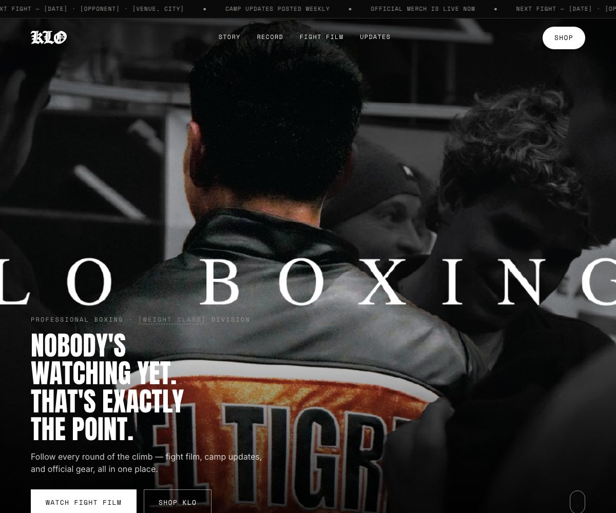
Photograph, division line, headline, and two actions: watch fight film, or shop.
- 02
Tale of the tape
Record, division, stance, reach, hometown, and status laid out like a fight-night graphic. Built to be updated one fight at a time.
- 03
The story
A pull quote slot in the fighter's own words, then a short biography.
- 04
Fight film
One featured video and a grid of clips, each with a date and title.
- 05
Latest from camp
Dated update cards for fight announcements, training notes, and merchandise drops, newest first.
- 06
Official shop
A ticket-styled entry point into the gear, closing the page on the brand line: built round by round.
A ticker above the navigation carries the next fight, camp cadence, and shop status, so the most time-sensitive facts sit at the very top of every visit.
03 · Visual system
Fight poster, not sports template.
The palette is almost entirely black, off-white, and smoke grey, which lets the black and white photography and one flash of colour in the fighter's jacket carry the emotion.
- Type. Anton, a heavy condensed face, for headlines that read like a bout sheet. Inter for body copy. Space Mono for labels, dates, and the ticker, which gives the data a stamped, official feel.
- Lettering. The fighter's name runs edge to edge in wide serif capitals behind the headline, closer to a poster than a web banner.
- Mark. A blackletter KLO wordmark anchors the navigation.
04 · Responsive and build
Hand-built and light.
- Static HTML, one stylesheet, one small script. No framework and no page builder.
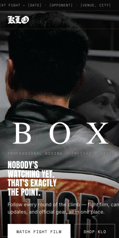
- Layout steps down through breakpoints from 900px to 480px, with the navigation, tape grid, and film grid each restacking for a phone.
- A skip link, a main landmark, and a reduced-motion rule are part of the build.
- Favicons and a touch icon are in place for home-screen use.
05 · Status
Design and build complete. Content in progress.
The site is public. Fight dates, biography details, clip titles, and the contact address are placeholders on the live build until the fighter's information is supplied.
Start here
Start with a 30-minute call. Leave with a clear scope.
Tell White Hill what the business needs. You get a defined scope, a fixed quote where one applies, and a clear next step.